.png)
The grid system in graphic design is a way of organizing
content on a page. Here, One grid, or a collection of grids, are used across an
entire project to achieve a consistent look and feel of a distinctive emotion.
Application of grids is possible in a number of probable ways and each designer
can look for a solution appropriate to his personal style. There is really no
limit to the grid layouts that can be created. Breaking out of the grid can
lead to the most interesting page designs.
Here, the story starts with Deep, Dark blues and Greens of
Confusion. Confusion is lack of understanding; uncertainty, situation
of panic; a breakdown of order, lacking direction or goal. Here person is
wedged in some boundaries and trying to come out of the situation. Red color
depicts the solution and person is just stuck in a puzzle.
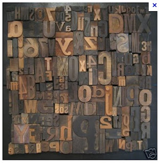
The grid composition is a puzzled mirror image of a confused
person’s brain. It describes how
confusion takes the power on person’s mind and a person becomes helpless.
Though he has his answers within, he is unable to perceive them.
The language and typography used to elaborate the meaning of
confusion, again says the same thing as is confusion is confused to find the
“key” of solution. The words “Disturbs”,
“Logical” are again describe the soul of the emotion.
In grid composition a meticulous outline shows the boundaries of a
confused person and the broken negative space shows the mental situation. It
shows how this confusion ends up with impossible exploration. The red grid is
hidden beneath other grids and a person is striving hard to get the solution
but due to misunderstanding he cannot see it. The chosen typeface portrays the
seriousness of the confusion and person’s pains in searching key.
.png)


