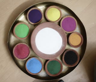
"Every Child is an Artist. The challange is to remain an artist after you grow up" — Pablo Picasso
Wednesday, September 12, 2012
Color
Color Name: Digital Blue
Sale for Product: Digital gadgets like laptop, printers, scanners
Color Name: Eco Green
Sale for Product: Environmental friendly products/ Medicines
Color Name: Magnetic Violet blue
Sale for Product: Stationary (papers, holders, binders)
Color Name: Aesthetic Brown
Mermaid Green
Sale for Product: Home furnish products
Color Name: Dreamy Blue
startling green
Sale for Product: Garment shop for youth
Color Name: Energetic Orange
Silent Blue
Sale for Product: Sports
Color Name: Brandy Blue
Creamy Purple
yummy light Blue
Sale for the Product: Ice-cream
Color Name: Sky Blue
Electric Blue
Sad Yellow
Sale for Product: Grain store
Color Name: Season purple
Sea green
All colors have their own mood and temperature. Since very long our eyes are used to look at certain products and now it has started to relate them with certain mood. For an example blue color shows coolness of water and sky and red or orange color shows the sun rays which are very hot/ harsh. This color sense helps us to relate certain products with their colors and it also becomes universal symbol like green color for leaves and red for rose.
The analogous colors are the neighboring colors and they match very well and create comfortable designs. I have selected the main color as "Blue" and according to me the analogy of blue is mostly found in nature. They are very pleasing and even contrast color will give an outstanding effect.
Complementary colors are opposite colors on the color wheel. They are the highly contrasting colors who creates a vibrant look especially when used with full saturation. It is very tricky and sometimes we fail for selection.
Colors are widely divided in so many sections and selecting some and combining them require so much concentration and wise selection. Sometimes we just color something just because we like it be that way. That is the most basic way of coloring some product. But to get the desired result, a little color study can help a lot. Understanding the value and mood of color will help a lot to decide about the color selection and we can achieve desired goal.
I have selected Garamond typeface. They are thick and serif fonts. I wanted to play with the serif fonts and negative positive space. For this exercise I gave the main importance to the "50% sale". I tried to emphasize the sale as it was a promotional advertisement. Here power of figure and ground plays a big role as this exercise is clubbed with color.
Subscribe to:
Comments (Atom)


